1.5 KiB
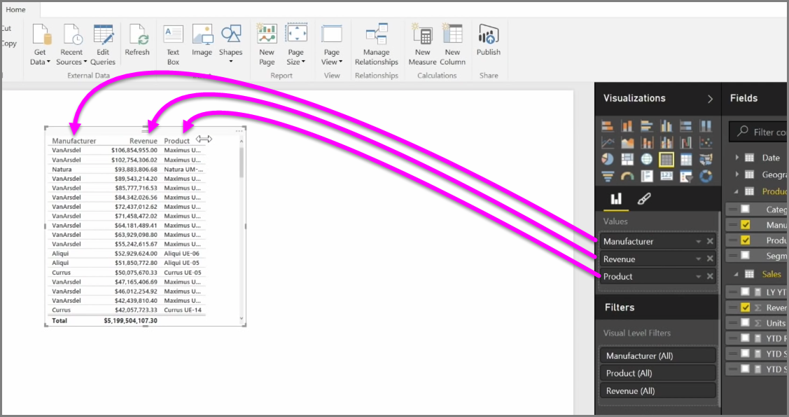
In addition to an abundance of charts, Power BI Desktop also supports more tabular visualizations. In fact, when you grab a categorical field or text field and drag it onto the report canvas, you get a table of results by default. You can scroll up and down through the table, and initially it will be sorted alphabetically.
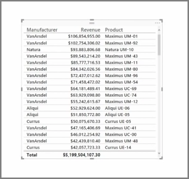
If you have numerical information in a table, such as revenue, a total sum will appear at the bottom. You can manually sort by each column by clicking on its header to toggle ascending or descending order. If a column is not wide enough to display all of its contents, click and drag the header sideways to expand it.
The order of the fields in the Values bucket in the Visualizations pane determines the order in which they appear in your table.
A matrix is similar to a table, but it has different category headers on the columns and rows. As with tables, numerical information will be automatically totaled along the bottom and right side of the matrix.
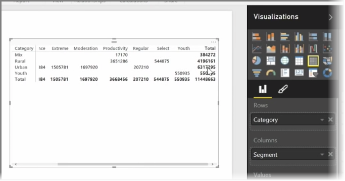
There are many cosmetic options available for matrixes, such as auto-sizing columns, toggling row and column totals, setting colors, and more. When creating a matrix, make sure your categorical data (the non-number data) is on the left of the matrix, and the numeric files on the right to ensure the horizontal scroll bar appears, and to make sure that scrolling behavior works properly.